
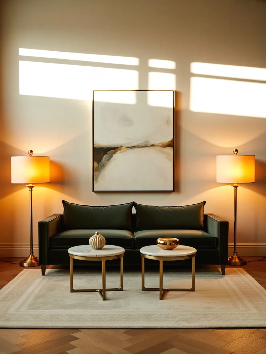
Above-Couch Wall Decor Mistakes That Make Your Living Room Look Unfinished

You’ve got a nice sofa, a decent rug, lamps you like, and yet the living room somehow still feels like it’s missing something. Nine times out of ten, the culprit is the big blank (or badly styled) wall above the couch. That single stretch of wall is the room’s focal point whether you’ve decorated it or not, and when it’s empty, floating with one tiny frame, or awkwardly arranged, the whole room reads as unfinished, no matter how good everything below it is.
The good news is that styling above a sofa runs on a handful of simple, almost mathematical rules, and nearly every “unfinished” living room is just breaking two or three of them. Here are the mistakes that quietly sabotage the space, and the exact fixes designers use, so you can get it right in an afternoon.
Mistake 1: Hanging everything too high
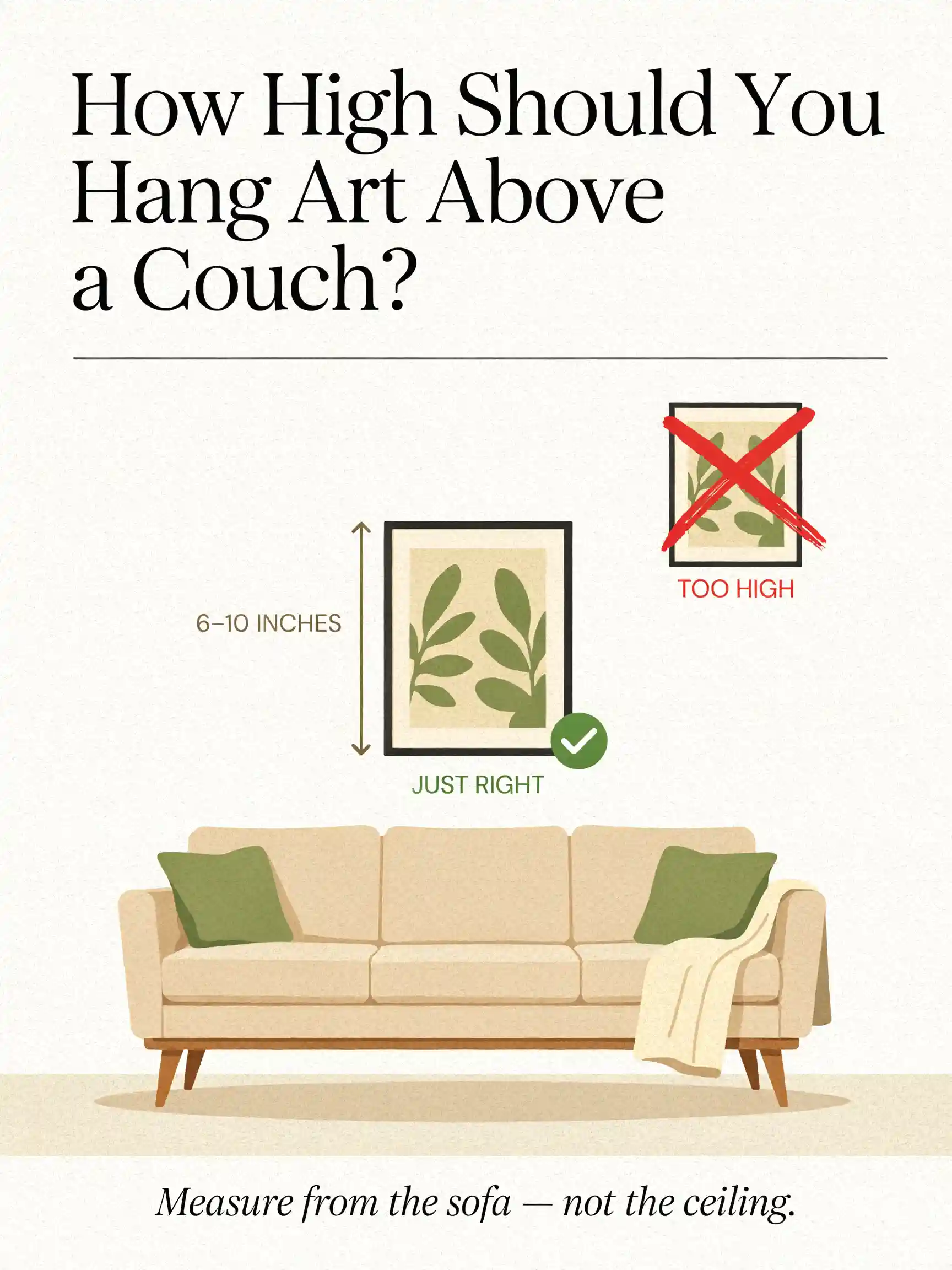
This is the number-one error, and once you see it you can’t unsee it. People hang art up near the ceiling, trying to “fill” the wall or center it in the empty space, and the result is art that floats, disconnected, marooned above the sofa with a sad gap of blank wall between them.
The fix: art above a sofa should relate to the sofa, not the ceiling. Hang it so the bottom edge sits just 6 to 10 inches above the back of the couch. That closeness visually anchors the art to the furniture and instantly makes the arrangement look intentional instead of accidental. Never measure down from the ceiling; measure up from the sofa.
Mistake 2: Choosing art that’s way too small
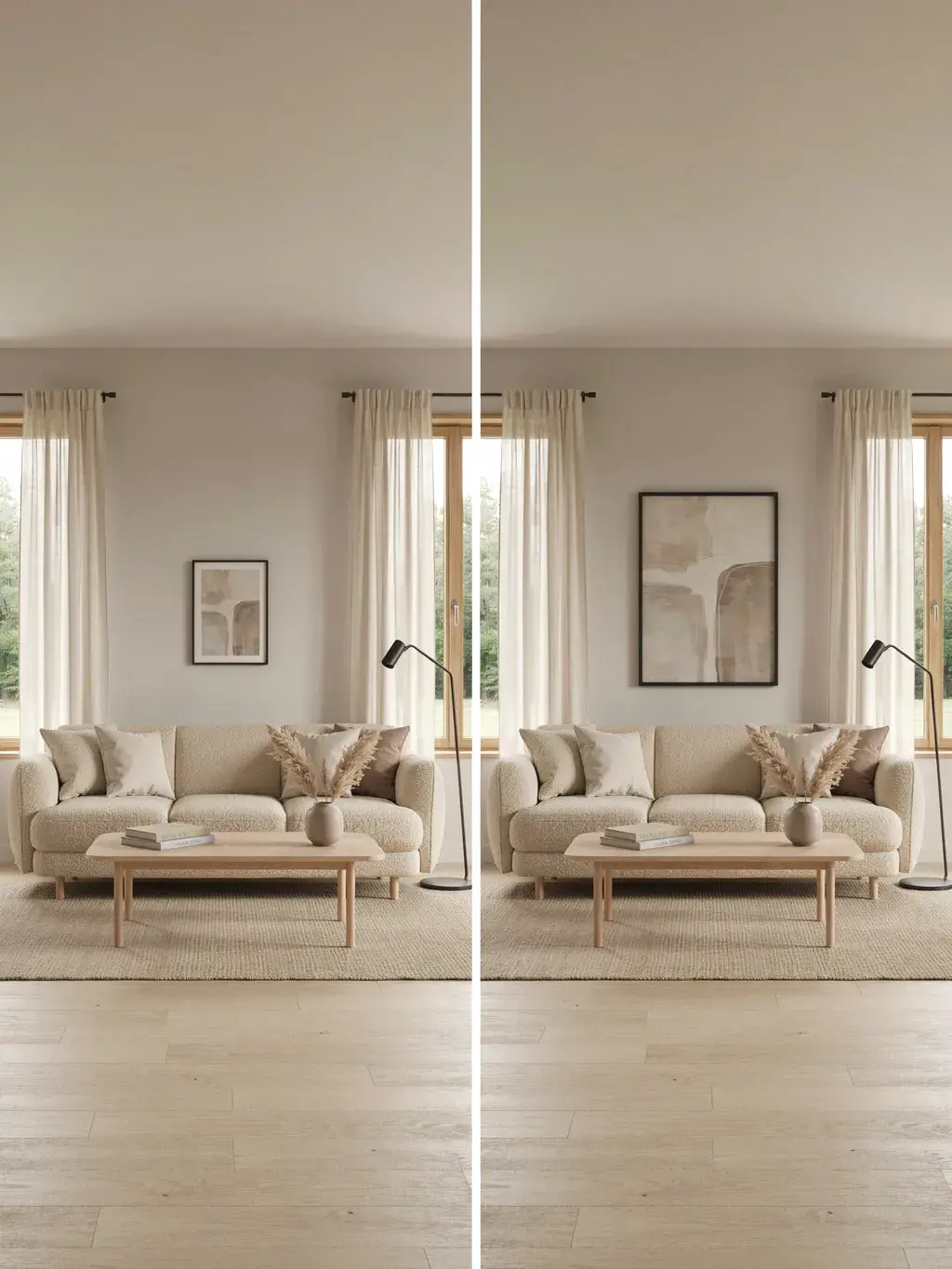
The other giant giveaway of an unfinished room: one little piece of art stranded on a big wall above a wide sofa. A small frame over a large couch looks lost and lonely, and it throws the whole proportion of the room off.
The fix is the rule designers swear by: your art (or arrangement) should span roughly two-thirds to three-quarters of the sofa’s width. For a standard 84-inch sofa, that’s art around 56 to 63 inches wide. Anything narrower than half the sofa’s width will always look undersized. Measure your couch, take two-thirds of that number, and shop to it.
Mistake 3: When in doubt, going smaller instead of bigger
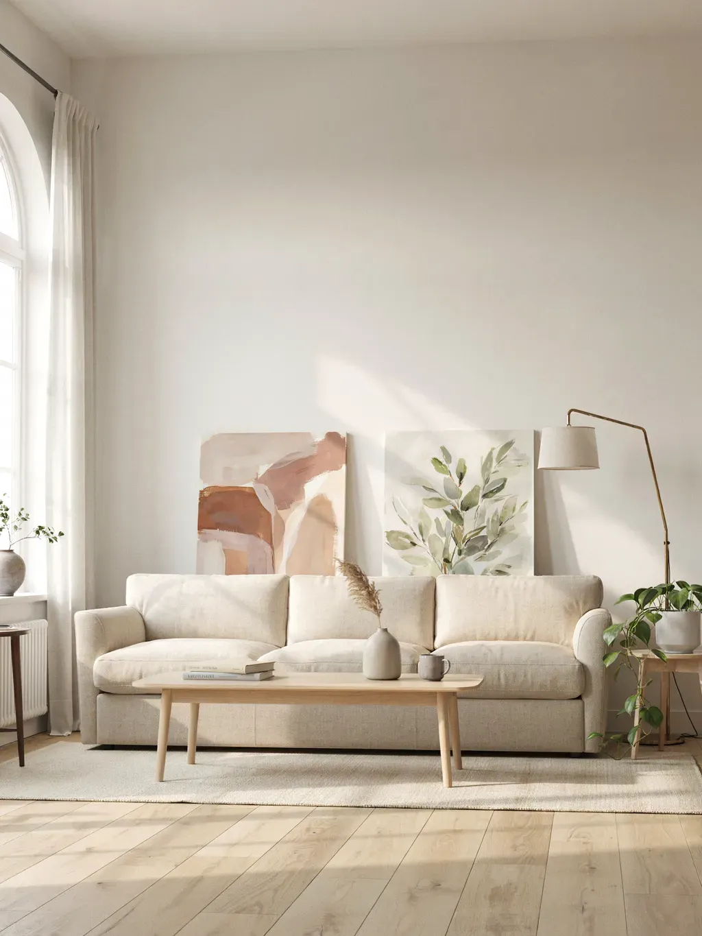
Related, and worth its own flag because people do it constantly: caught between two sizes, they play it safe and pick the smaller one. Almost always the wrong call. Undersized art is one of the most common decorating mistakes there is, while generously scaled art reads as confident and finished.
The fix: when you’re between sizes, size up. A piece that feels almost too big on the floor usually looks just right on the wall. Err generous, and the room looks designed rather than tentative.
Mistake 4: Centering art on the wall instead of over the sofa
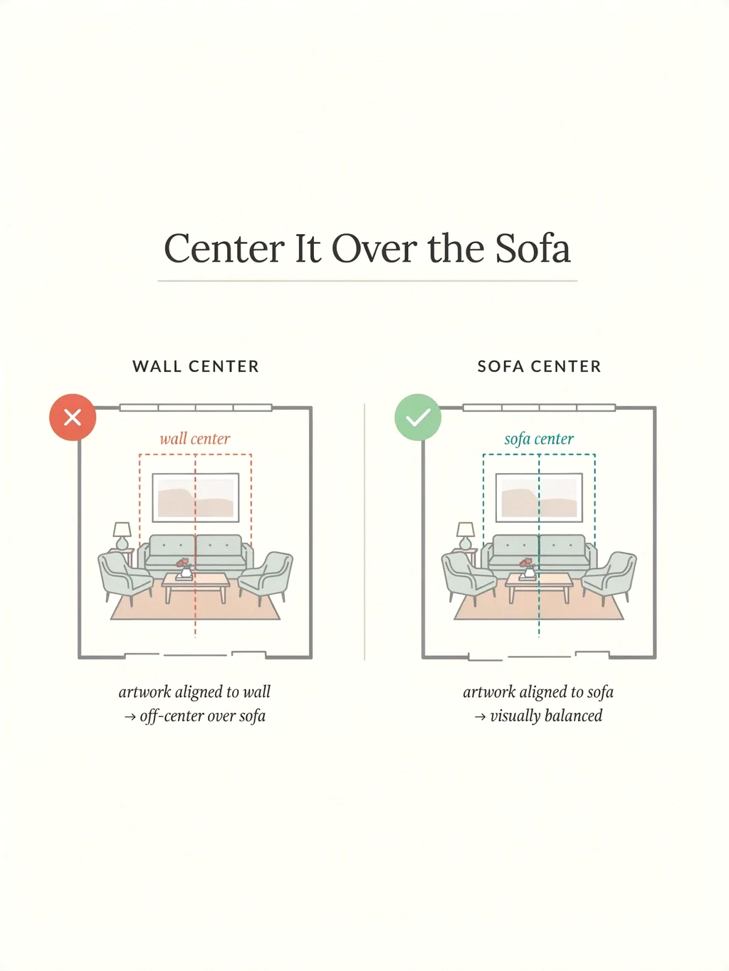
A subtle one that quietly makes things feel off. People center their art in the middle of the wall, even when the sofa sits off-center beneath it, which leaves the art visually disconnected from the furniture it’s supposed to crown.
The fix: always center the art over the sofa, not the wall. The sofa is the anchor, and the art is an extension of it. When the piece lines up with the furniture below, the whole vignette reads as one cohesive unit, which is exactly the “finished” look you’re after.
Mistake 5: Scattering too many tiny pieces with no plan
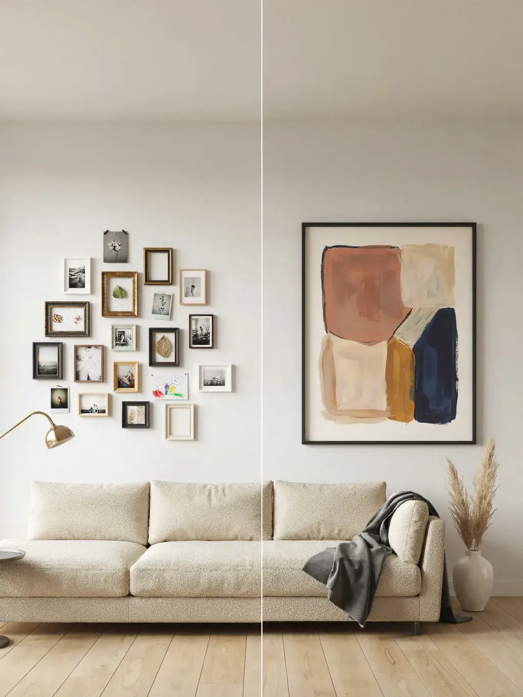
In an effort to fill the wall, people tack up a scatter of small, mismatched frames at varying heights with no logic, and instead of a focal point they get visual chaos. A jumble of little pieces reads as busy and unfinished, not curated.
The fix: either commit to one confident statement piece, or plan a proper gallery arrangement as a single unit. If you go multiple, treat the whole grouping as one shape that still hits that two-thirds-of-the-sofa width. One bold piece almost always feels more refined than a dozen little ones fighting each other.
Mistake 6: Inconsistent spacing in a gallery wall
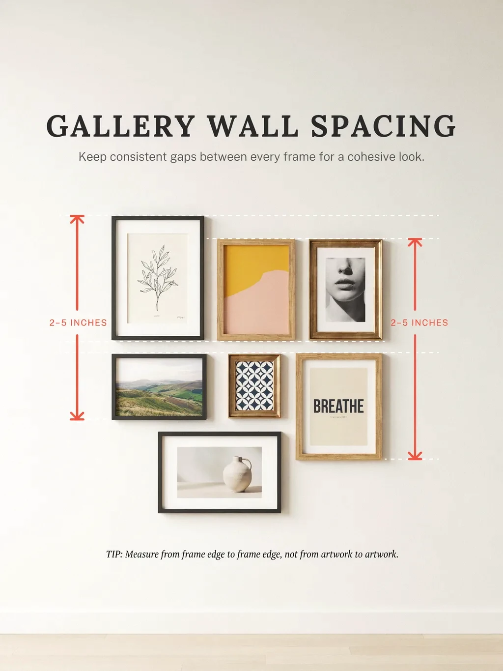
If you do go the gallery route, uneven gaps are what make it look amateur. Frames crammed too close in one spot and drifting too far apart in another create a restless, haphazard feel.
The fix: keep consistent spacing between every piece, generally 2 to 5 inches, and hold that same gap throughout the whole arrangement. Consistency matters more than the exact number; pick a gap and stick to it religiously. Even, uniform spacing is what makes a gallery wall read as one intentional composition.
Mistake 7: Not planning the layout before you hang
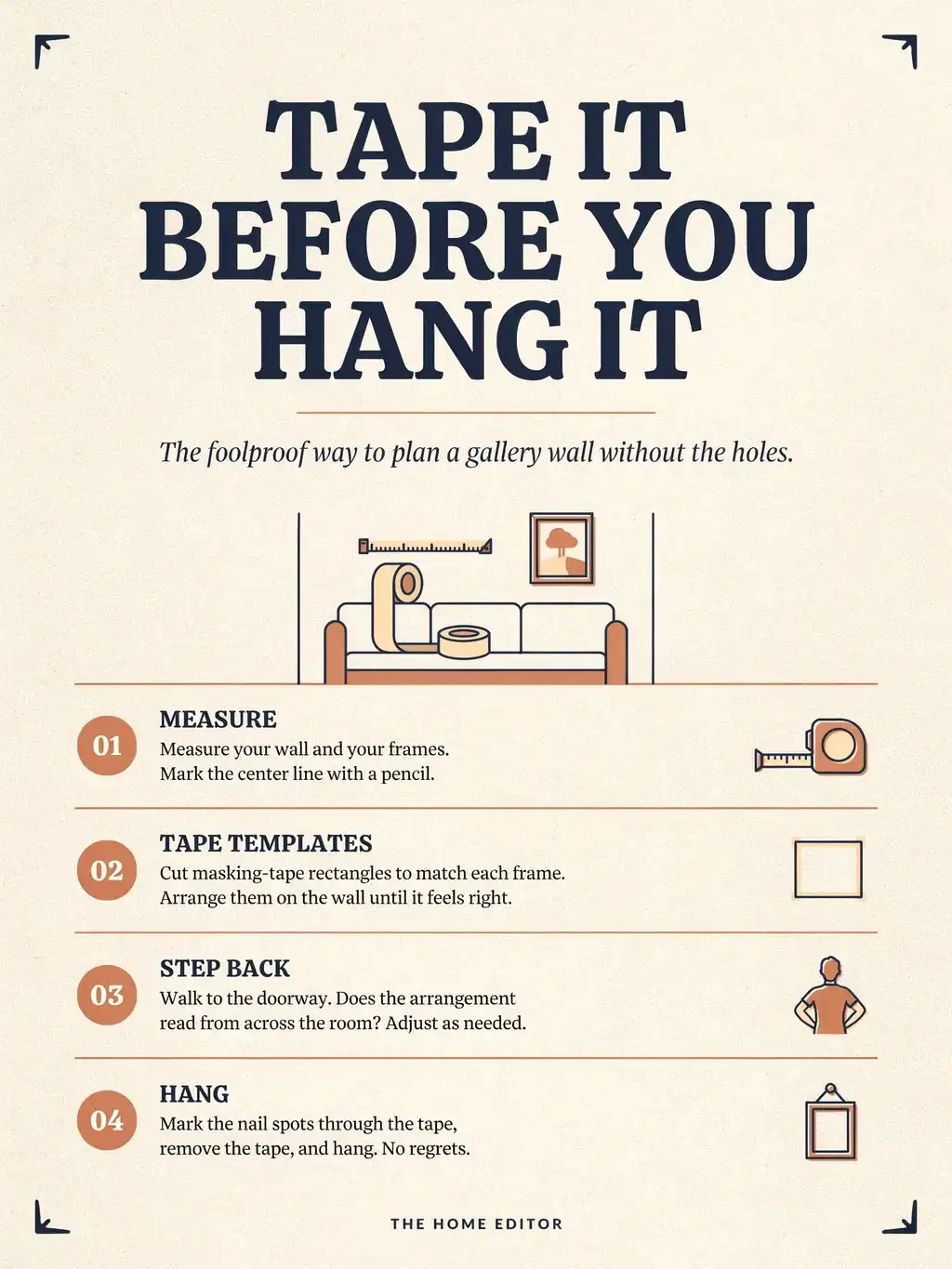
The invisible mistake behind several of the others: grabbing a hammer and winging it. Hole after hole in the wall, pieces ending up crooked or badly spaced, and a grouping that never quite gels.
The fix: tape it out first. Cut paper (or painter’s tape) templates the size of your frames and arrange them on the wall, or lay the whole arrangement out on the floor, before a single nail goes in. Step back, adjust, and only hang once it looks right. “When in doubt, tape it out” is the single best habit for getting this right the first time.
Mistake 8: Ignoring the 57-to-60-inch eye-level rule
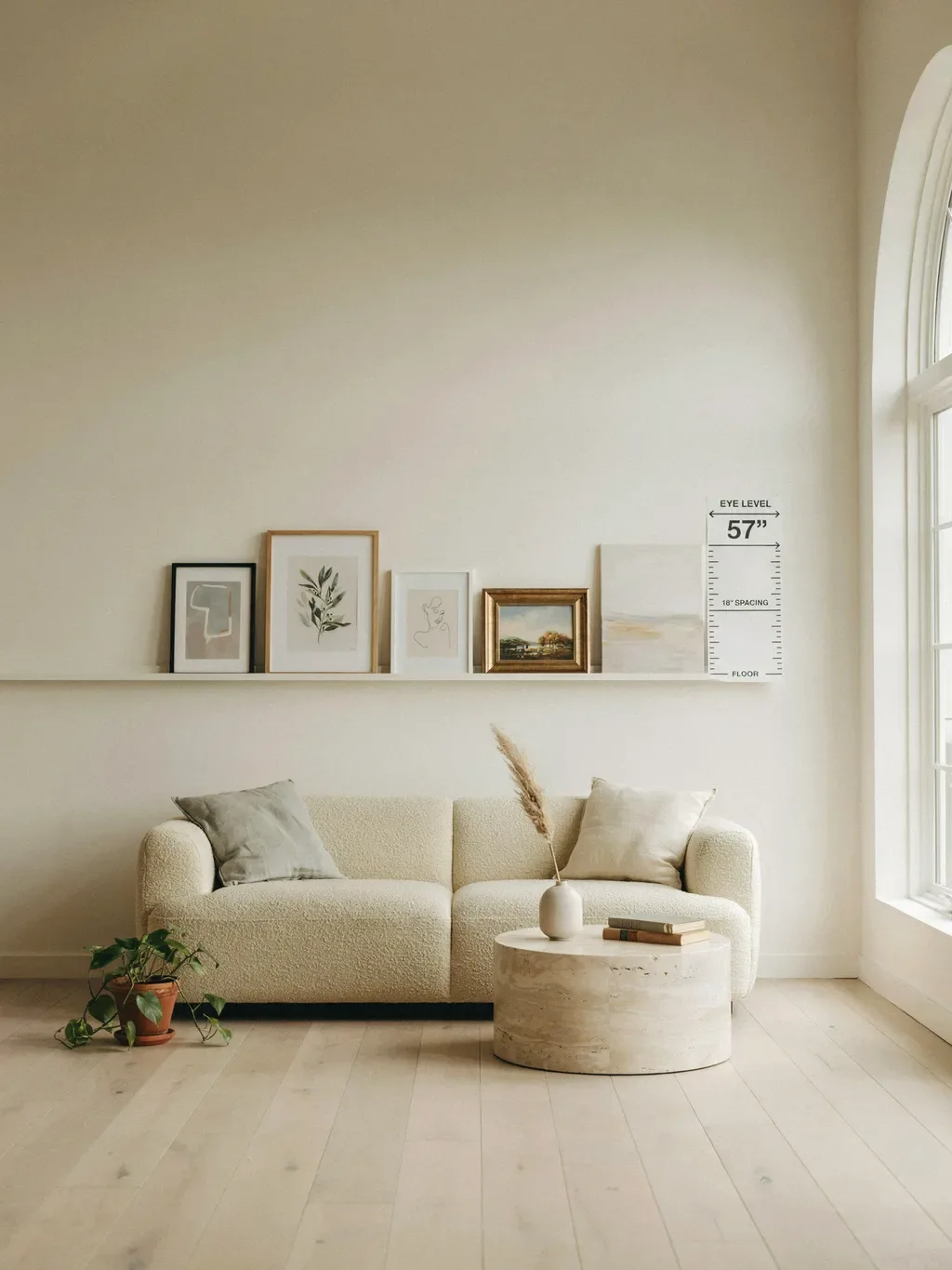
When art isn’t going above furniture, or on a tall wall, people misjudge height and hang by guesswork. Galleries don’t guess: they hang to a standard eye level.
The fix: aim for the center of the artwork (or the center of a whole grouping) to land around 57 to 60 inches from the floor, standard average eye level. Above a sofa, the 6-to-10-inch rule takes priority, but for the broader wall this eye-level benchmark keeps everything at a natural, comfortable height rather than too high or too low.
Mistake 9: Using only one type of art
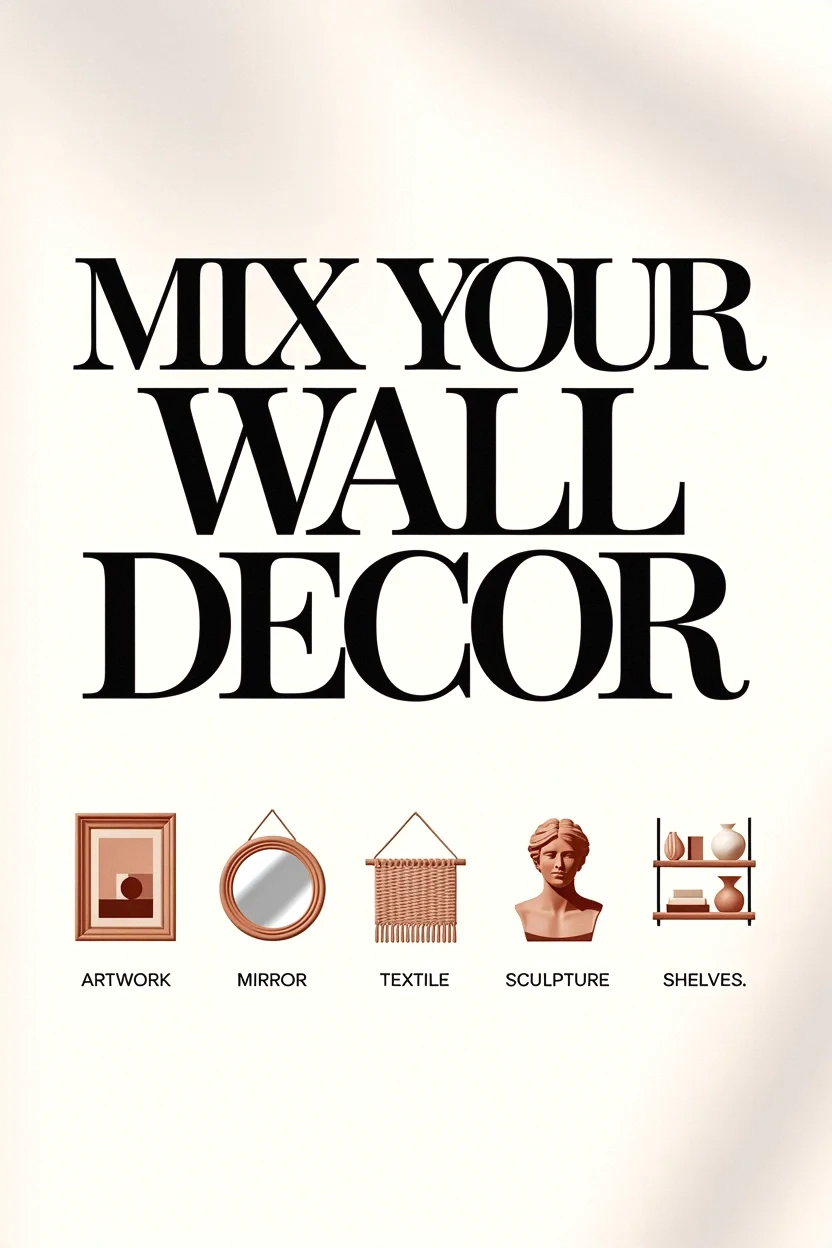
An all-matching set of identical frames can feel flat and a bit like a showroom. Rooms that look truly finished usually have a little more depth and variety than a single repeated element.
The fix: layer different media, mix framed prints with a mirror, a woven piece, a small 3D object, or a piece of sculpture. That variety in texture and form creates a collected, intentional look. You don’t need a lot; even one non-flat element among the frames adds the depth that makes a wall feel designed.
Mistake 10: Forgetting the flanking lamps and furniture
People style the wall in isolation, then wonder why it competes awkwardly with the tall floor lamps on either side of the sofa or the shelves nearby. The wall decor has to share the composition with everything around it.
The fix: consider the whole picture. If floor lamps flank the sofa, or you’ve got sconces or shelves in play, factor their height and visual weight into your arrangement so nothing clashes. The goal is a balanced composition across the entire sofa zone, not a nice piece of art fighting a lamp for attention.
Mistake 11: Leaving the wall totally blank
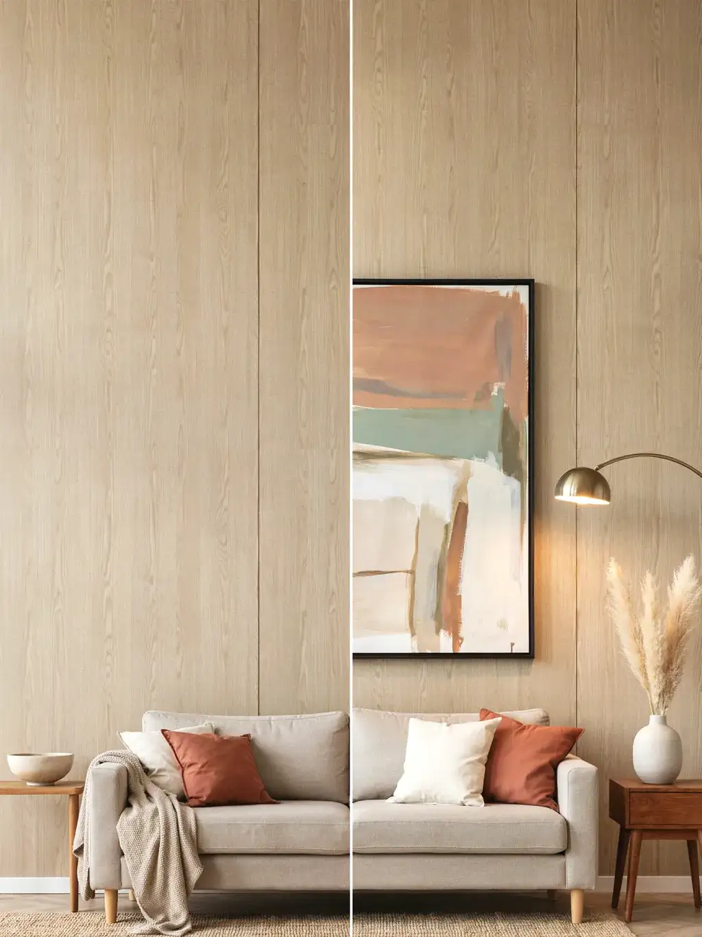
Sometimes the mistake is simply doing nothing, leaving that prime focal wall empty while the rest of the room is furnished. An empty wall above a sofa is the most common reason a living room feels unfinished, full stop.
The fix: fill it, even simply. It doesn’t have to be expensive art, a large mirror, a single oversized print, a tapestry, or a picture ledge with leaning frames all work. The point is to give the room’s focal point something intentional to look at. Almost anything considered beats a blank stare.
Mistake 12: Overlooking a mirror as the easy win
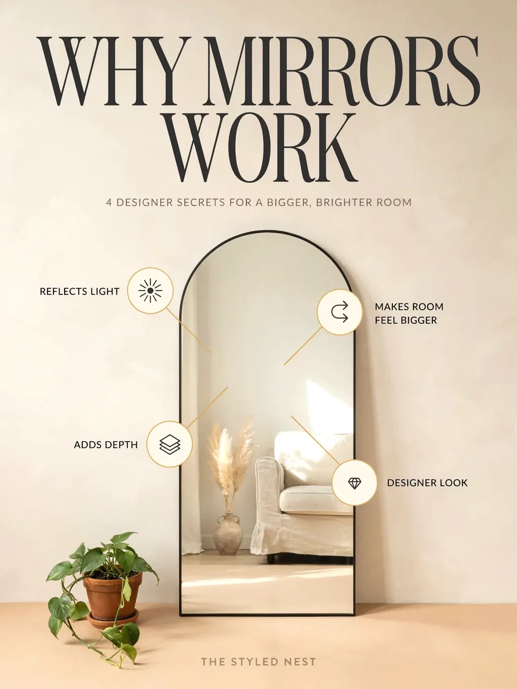
Related to the blank-wall problem: people assume they need to find the perfect art and get stuck, when a mirror would solve everything faster. A large mirror above a sofa is a timeless choice that reflects light, makes the room feel bigger and brighter, and instantly fills the space with something that feels intentional.
The fix: if art paralysis is the holdup, hang a generously sized mirror instead (still following the two-thirds width and 6-to-10-inch height rules). Just mount it securely into a stud with proper anchors, since mirrors are heavy. It’s often the single easiest way to finish the wall.
Mistake 13: Skipping a flexible picture ledge
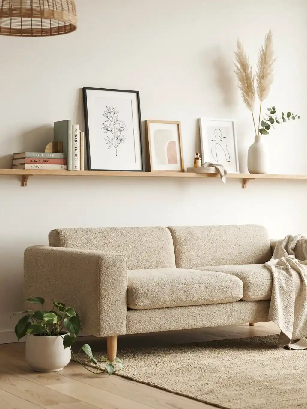
For people who freeze at the permanence of nail holes, or who like to change things seasonally, not considering a picture ledge is a missed trick. A shallow shelf mounted above the sofa lets you lean and layer art, swap it whenever, and avoid committing to one arrangement.
The fix: install a picture ledge and style it with one larger anchor piece off to one side, a couple of smaller leaning frames, and maybe a small object for dimension. It’s forgiving, flexible, and looks deliberately styled, all while sparing your wall a grid of holes.
Mistake 14: Cheap frames and reflective glass in the wrong spot
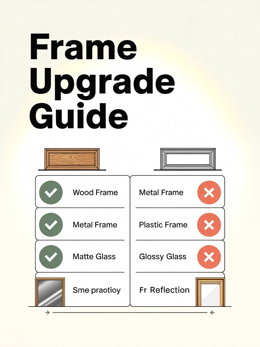
The art can be right and the framing can still undercut it. Flimsy frames cheapen a piece, and glossy reflective glass hung opposite a window or lamp turns your art into a glare-filled mirror you can’t actually see.
The fix: invest a little in frames and finish, since the right frame elevates art from decorative to designer-worthy (floater frames flatter canvases; simple wood or metal suits most rooms). And position reflective pieces away from direct light sources, or choose non-glare glass, so the art reads clearly instead of bouncing back the room.
Mistake 15: Forgetting to consider visual weight and color
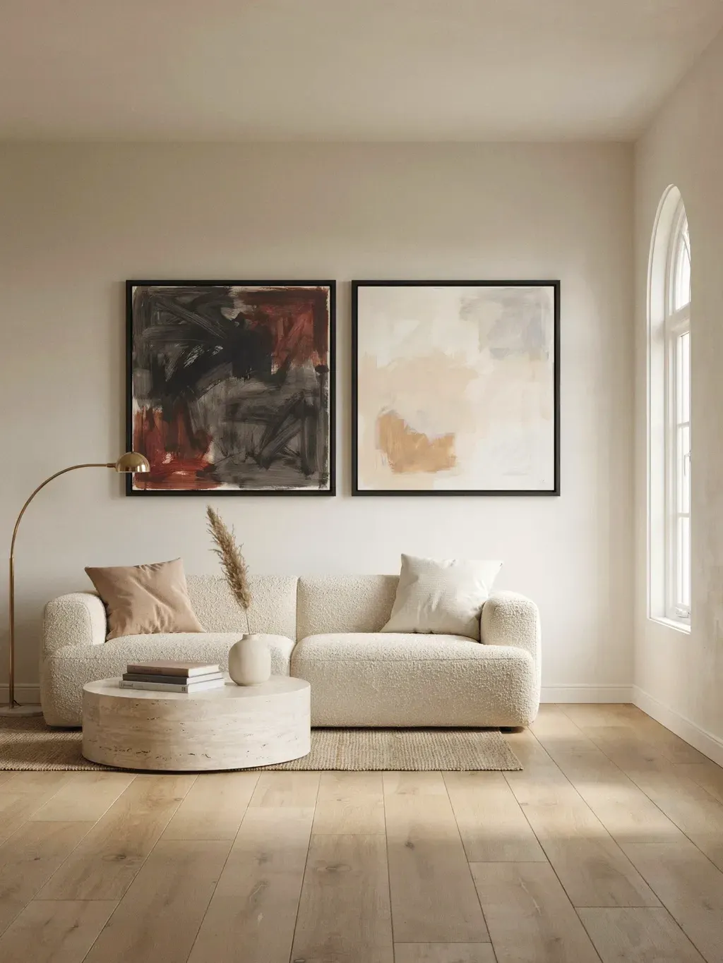
A less obvious one: two pieces the same physical size can feel very different on the wall depending on their color and contrast. A dark, high-contrast piece feels heavier and larger; soft, layered neutrals feel lighter. Ignore this and your carefully sized art can still feel off-balance.
The fix: factor in the visual weight, not just the measurements. If a wall feels too heavy or too washed-out, adjusting the tone and contrast of the art, not just its size, can rebalance the whole composition. Match the art’s weight to the mood you want the room to have.
Mistake 16: Letting the art float in a sea of empty wall
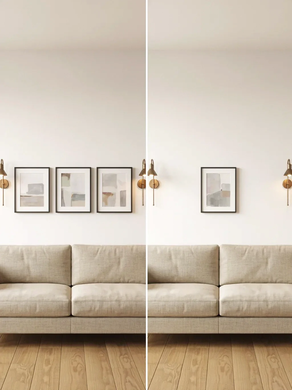
Even correctly sized art can look unfinished if it’s stranded in the middle of a very large or tall wall with nothing around it. On a big wall, a single piece that’s perfectly proportioned to the sofa can still leave vast empty margins that read as bare rather than breezy.
The fix: on an oversized wall, scale up your whole approach, go for a larger statement piece, a triptych that spans wider, or flank the central art with a symmetrical pair of sconces or smaller pieces to fill the extra real estate. The art should feel generous against the wall, not swallowed by it.
Mistake 17: Matching the art to nothing else in the room
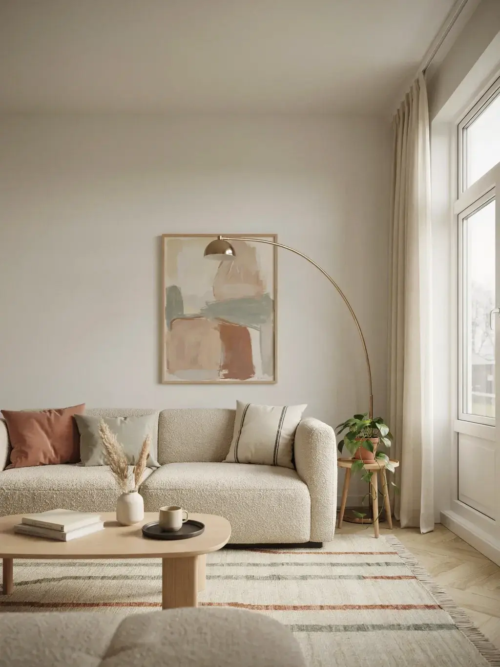
A wall can be perfectly measured and still feel disconnected if the art relates to nothing else in the space, clashing colors, a style that fights the furniture, a mood that doesn’t match. The eye senses the mismatch even if it can’t name it, and the room feels slightly off.
The fix: pull at least one color or tone from elsewhere in the room, the rug, a cushion, the curtains, into the art above the sofa. That small thread of repetition ties the wall into the whole room and is a big part of what makes a space feel cohesive and finished rather than assembled from unrelated parts.
Mistake 18: Going vertical when the wall wants horizontal (or vice versa)
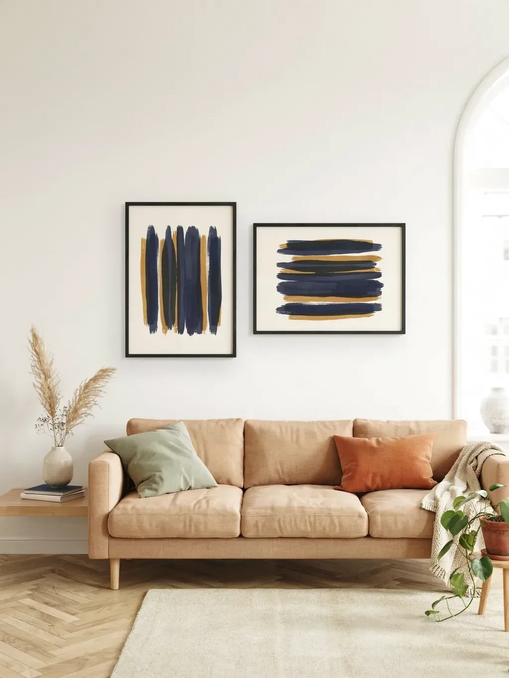
Orientation trips people up. A tall, narrow vertical piece over a long low sofa can look mismatched, while a wide horizontal piece on a tall narrow wall can waste all that lovely height. The shape of the art should answer the shape of the wall and furniture.
The fix: for a standard sofa on a standard wall, a wide horizontal piece (or horizontal grouping) usually feels the most balanced and architectural. Save vertical compositions for tall or narrow walls, or rooms with vaulted ceilings where you want to draw the eye up. Match the orientation to the space and it instantly looks more resolved.
Mistake 19: Forgetting function where the wall could work harder
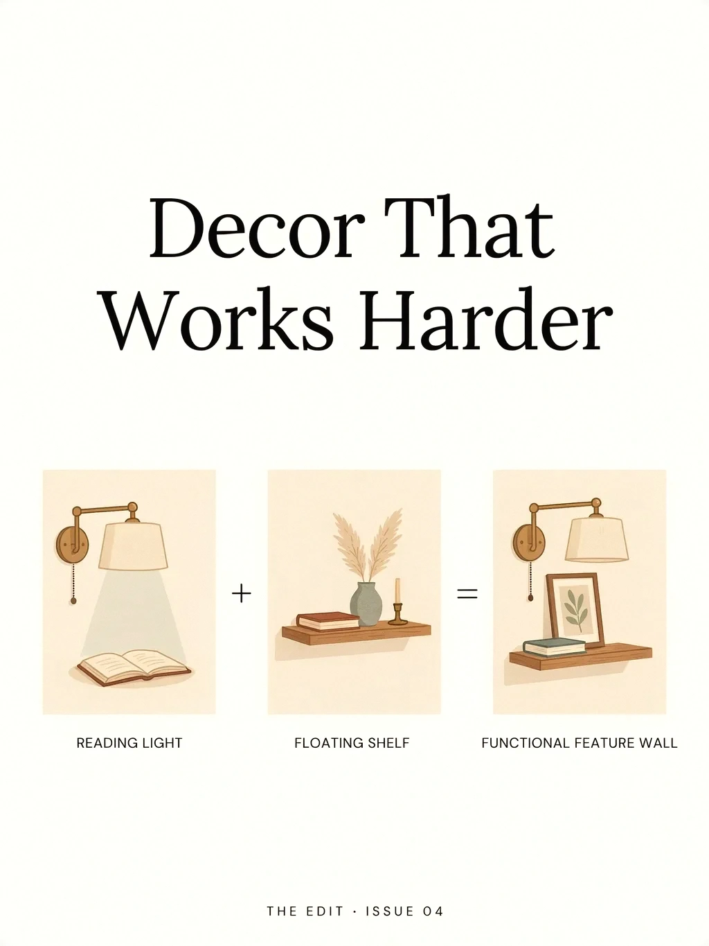
Sometimes the wall feels unfinished because it’s purely decorative in a spot that could do more. Above a sofa used for reading or entertaining, a lone piece of art can feel like a missed opportunity for the practical touches that make a room feel lived-in and complete.
The fix: where it suits your life, mix in function, wall-mounted reading lamps or slim swing-arm sconces, a floating shelf for books and a few objects, or a picture ledge that doubles as display. Blending the useful with the beautiful reads as thoughtful, layered, and finished rather than staged.
Mistake 20: Treating the rules as unbreakable
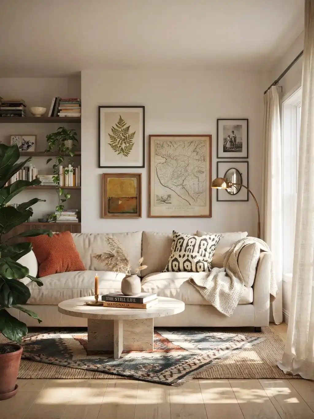
The final mistake is the opposite of all the others: following the formulas so rigidly that the room feels stiff and impersonal. The proportions and heights are a foundation, not a straitjacket.
The fix: use the two-thirds rule, the 6-to-10-inch height, and the spacing guides to get the bones right, then trust your eye and let your personality in. Hang a piece slightly off-center for drama if it feels right; choose art you actually love over art that merely fits. The rules get you to “finished”; your taste is what makes it yours.
The bottom line
An unfinished-looking living room almost always traces back to that wall above the sofa, and almost always to the same handful of fixable mistakes: art hung too high, art too small, pieces centered on the wall instead of the couch, and no real plan behind the arrangement. Get the formula right, two-thirds the sofa’s width, bottom edge 6 to 10 inches above the back, centered over the furniture, spaced consistently, and taped out before you hang, and that blank, awkward wall turns into a genuine focal point. It’s the finishing touch the whole room was waiting for, and it costs nothing but a little measuring and a willingness to size up.